tease
Electronic Drawers, That’s All
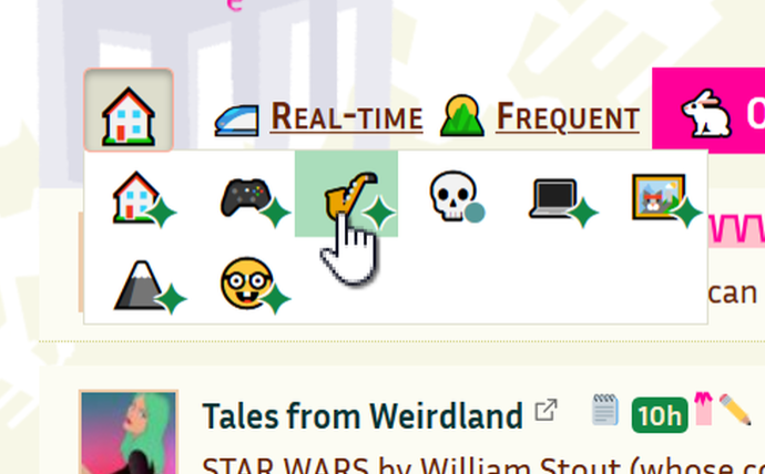
Oh and where did the tabs go? There have been some issues among users with lots of tags - the tabs were filling up the screen. So now they’ve been tucked away into a dropdown grid.
Originally, the plan was to have a tree-like dropdown of tags. But getting the aesthetic to work - well, it just didn’t. This new menu simplifies and unclutters the whole page.
It also allows us to accomodate colorblind users by using symbols in addition to colors on the ‘freshness’ indicator. A star for new posts in the last three days. A circle for new posts in the last 30 days.

This post accepts webmentions. Do you have the URL to your post?
You may also leave an anonymous comment. All comments are moderated.

